Flolube. Giving industrial lubricants a smarter identity.
Flolube came to me with an interesting challenge — to brand a new range of industrial lubricants that aren’t just hard-working, but forward-thinking too.
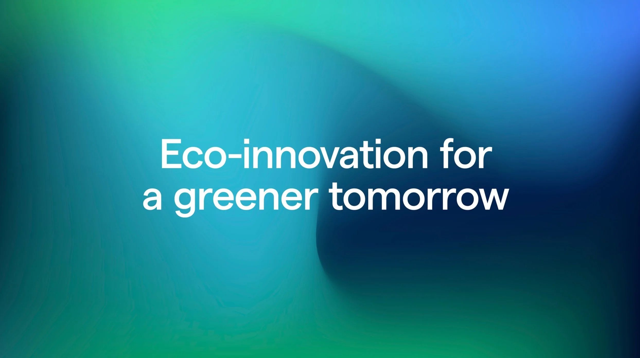
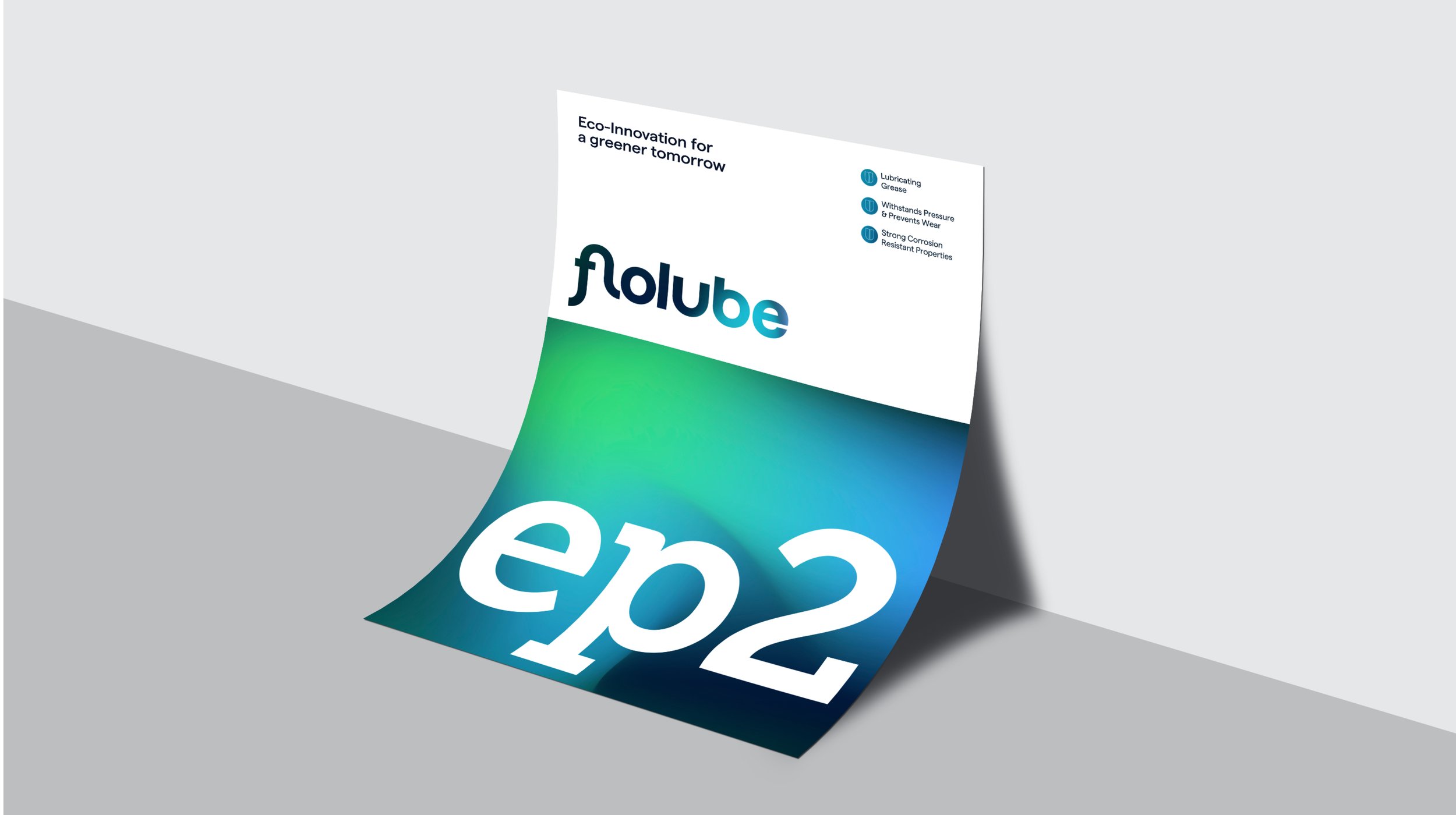
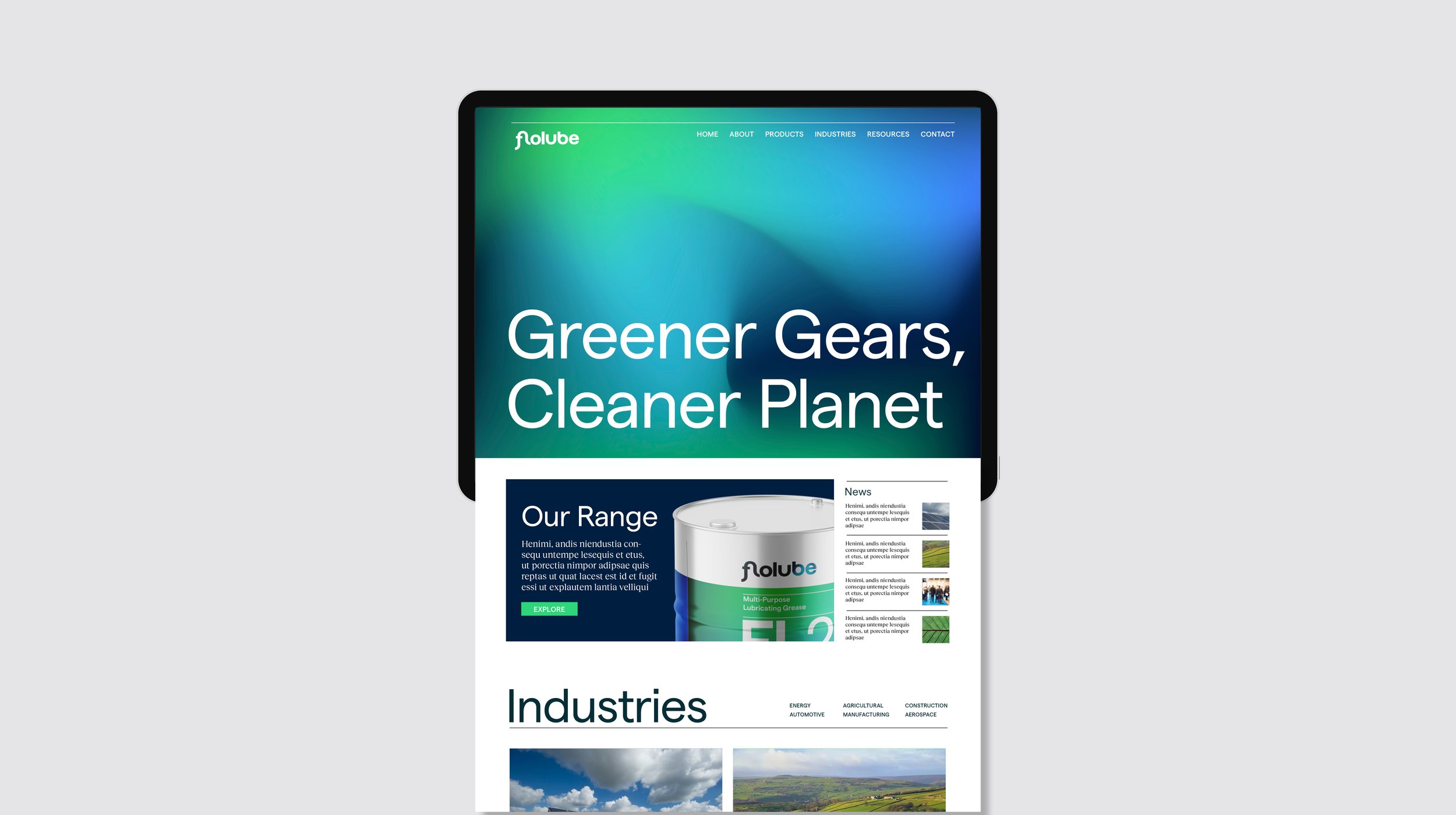
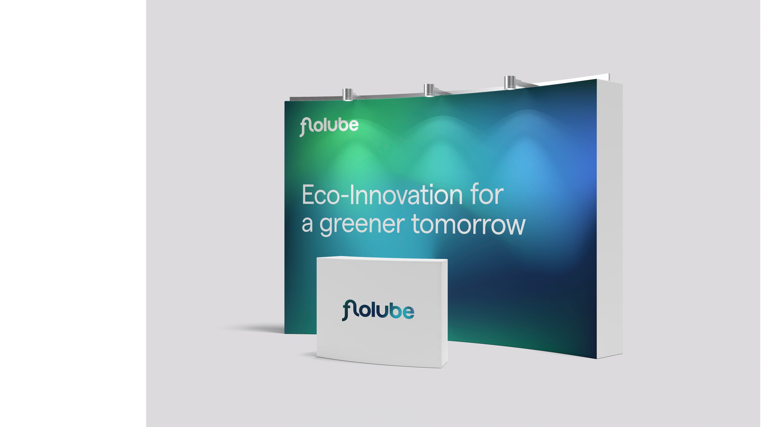
These products are engineered for tough environments — high-load, high-temperature, heavy-duty applications — but made with sustainability in mind. What they needed was an identity that could hold its own in a technical, no-nonsense sector, while still feeling modern, premium, and different.
Industrial lubricants aren’t typically known for their branding. The sector leans heavily on the same visual language: hard lines, bold type, lots of red and black. Flolube needed to break that mould. The challenge was to create something that still spoke to engineers, buyers and specifiers — but in a way that felt clean, intelligent, and reflective of the product’s more progressive credentials.
It was also important to communicate performance clearly and confidently — no fluff, just a clear sense of trust and technical capability.