Page & Co. An established name, a fresh perspective.
Page & Co is an independent, family-run estate and letting agency based in Canterbury, Kent. Known for its personal approach, local knowledge and strong reputation, the business wanted to refresh its identity to better reflect its character and ambitions.
The challenge was to introduce a more confident, contemporary look without losing the familiarity and trust the business had already built.
The project also presented an opportunity to develop Village Homes, a specialist offering for distinctive rural and village properties across Kent.
Building on what matters
Rather than starting again, the approach was to identify what was already working and build on it.
Page & Co had an established name, a recognisable orange and a clear sense of what made the business different. The refreshed identity needed to retain those familiar elements while creating something more considered, distinctive and adaptable.
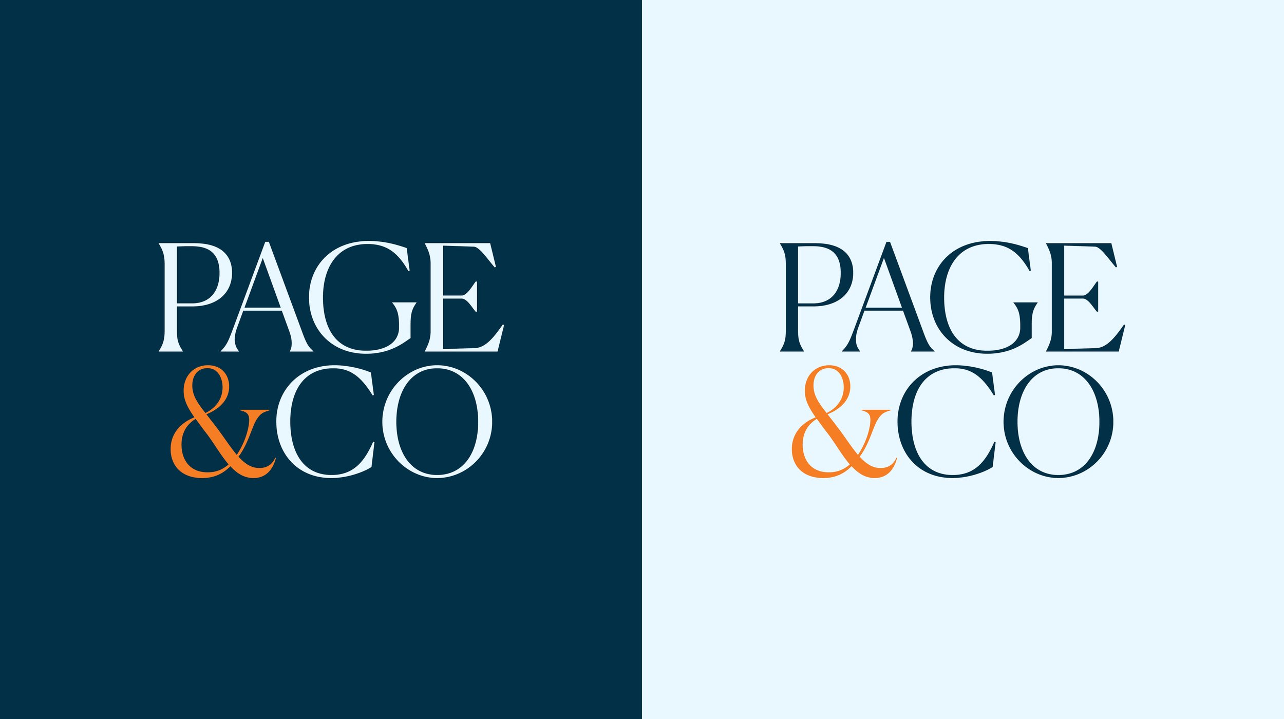
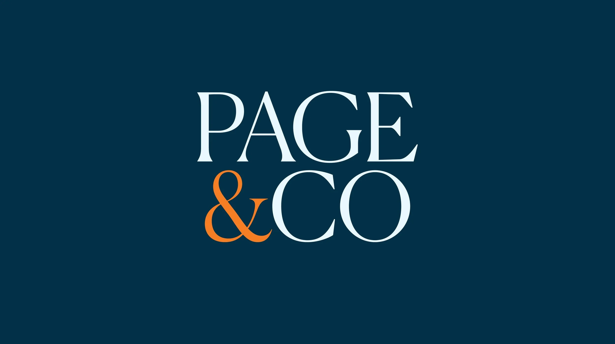
A new typographic identity places the company name at the centre, with an expressive ampersand giving the brand a recognisable feature of its own. Refined typography, a deep navy and a carefully adjusted orange bring a balance of character, confidence and approachability.

One brand, two distinct offers
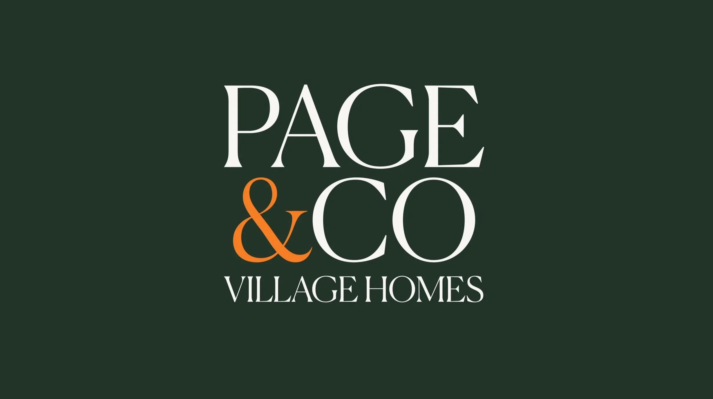
Alongside the main identity, I explored how Village Homes could sit within the wider Page & Co brand. Created for the agency's more individual rural and village properties, Village Homes needed a different feel without becoming a disconnected business.
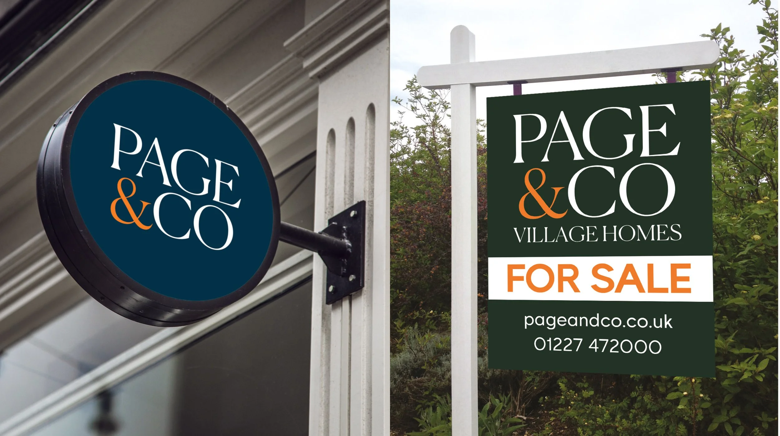
The solution was a closely related identity, retaining the main Page & Co wordmark and introducing a distinctive deep green palette. The shared typography and orange ampersand maintain a clear family resemblance, while the additional Village Homes signature gives the specialist offering its own character. The result is a simple brand structure that makes sense to customers and allows the business to develop its services without losing the strength of its established name.

Designed to work in the real world
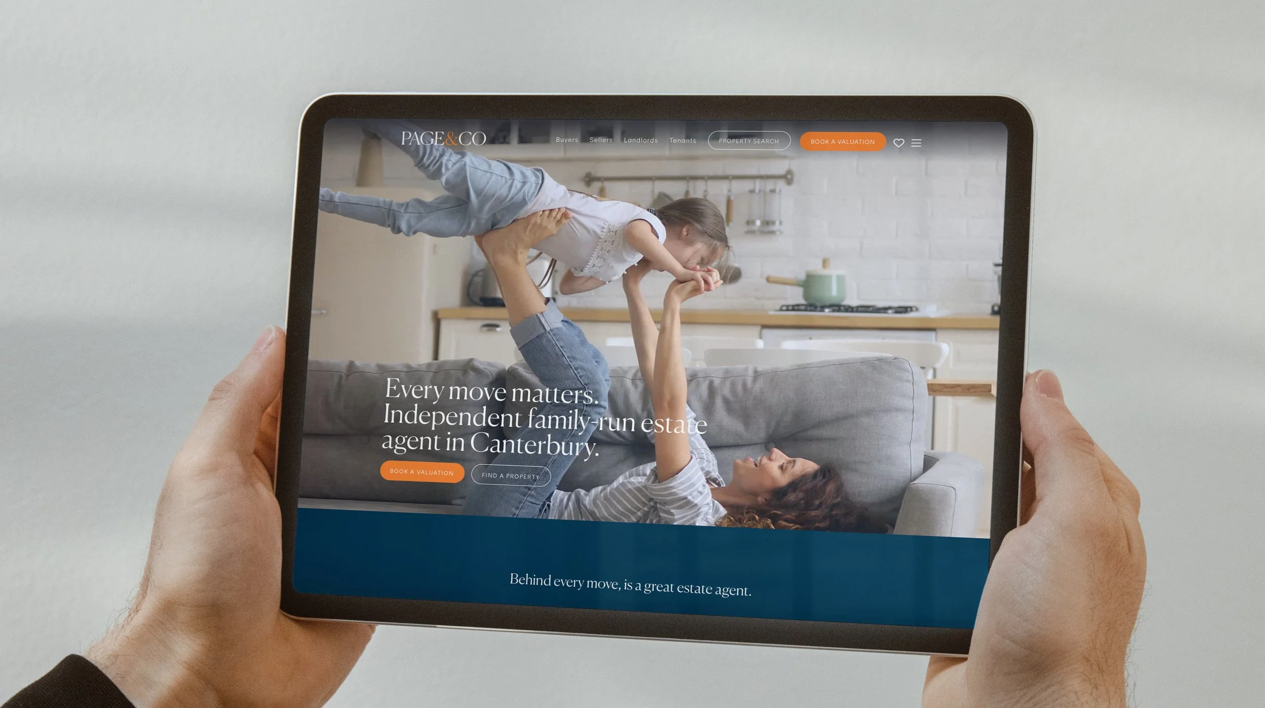
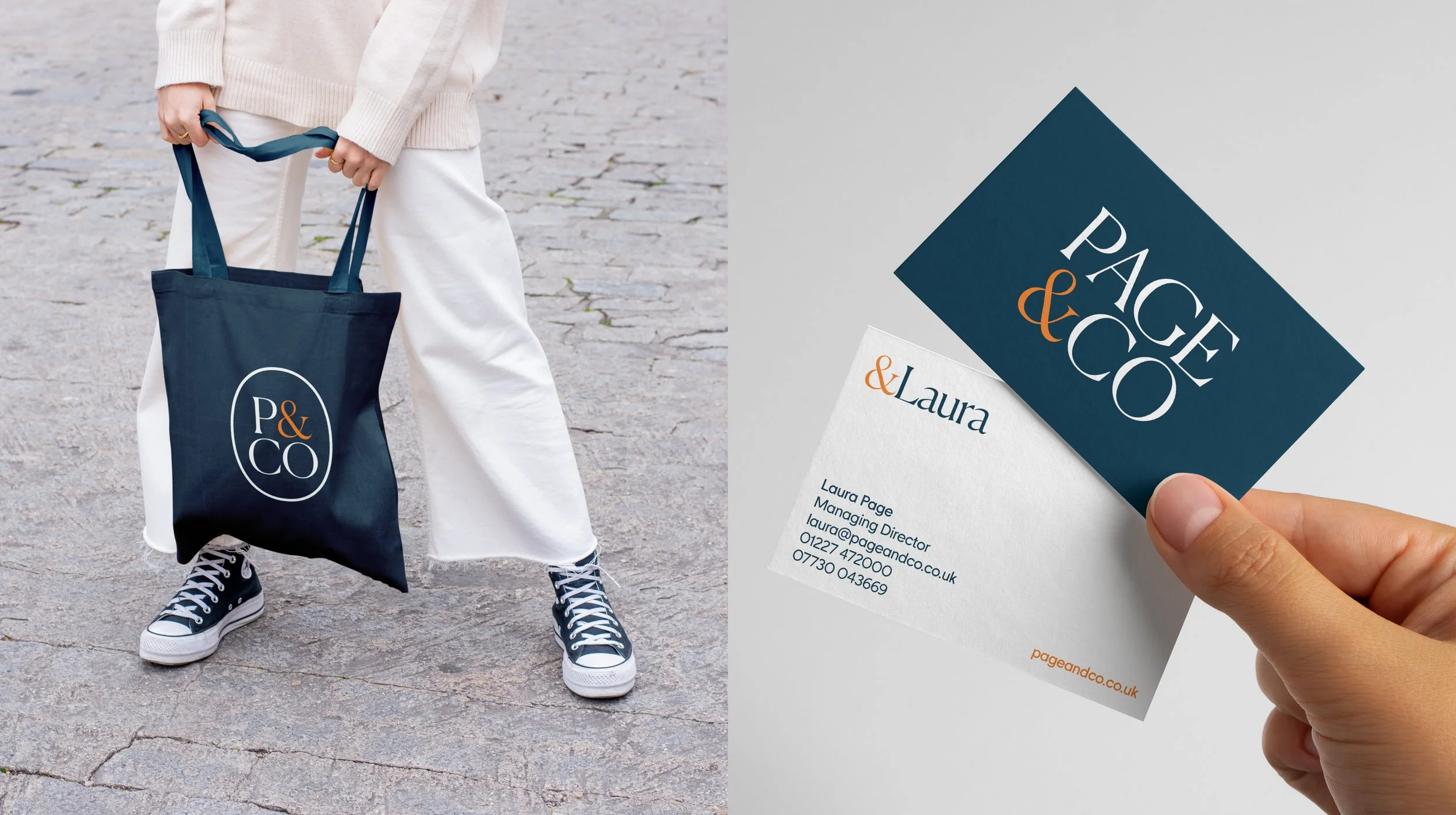
The identity was developed beyond the logo, with a consistent visual approach carried through business stationery, branded business cards, presentation materials and property signage.
For Sale, Sold and To Let boards were particularly important. These are among the most visible expressions of an estate agency's brand, so clarity, recognition and impact at a distance were central to the design.
A supporting palette, typography and logo variations provide the flexibility needed across different formats while keeping both identities recognisably connected.
The result is a refreshed identity that feels more assured and distinctive, while remaining true to the personal, independent business behind it.