The Black Opportunities Platform. Building a brand.
Connecting a community.
The BOP (The Black Opportunities Platform) is a UK-based professional community helping Black professionals connect, share experiences and access opportunities for personal and career development.
I've worked with founder Jude Davis across several stages of the project, from the original brand identity through to app concepts, UX/UI design and the development of the digital platform.
A brand built around progress
The starting point was to create an identity that felt confident and credible without looking like another corporate networking business.
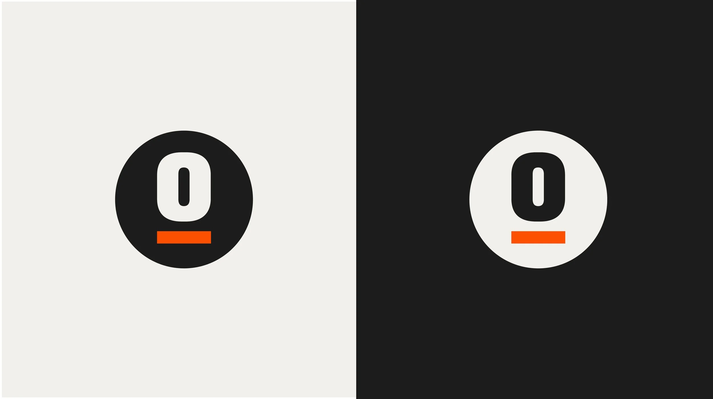
The idea came from the name itself. The raised 'O' in the wordmark represents progress, supported by a small orange bar acting as a platform. It's a simple detail that gives the logo meaning and provides the basis for the wider identity.
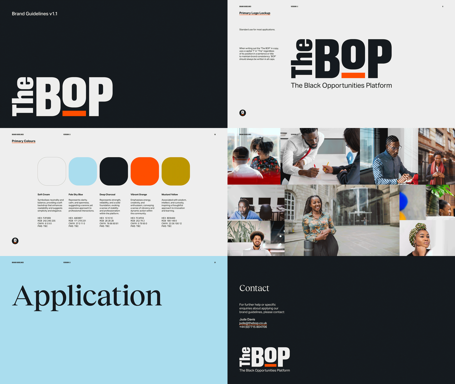
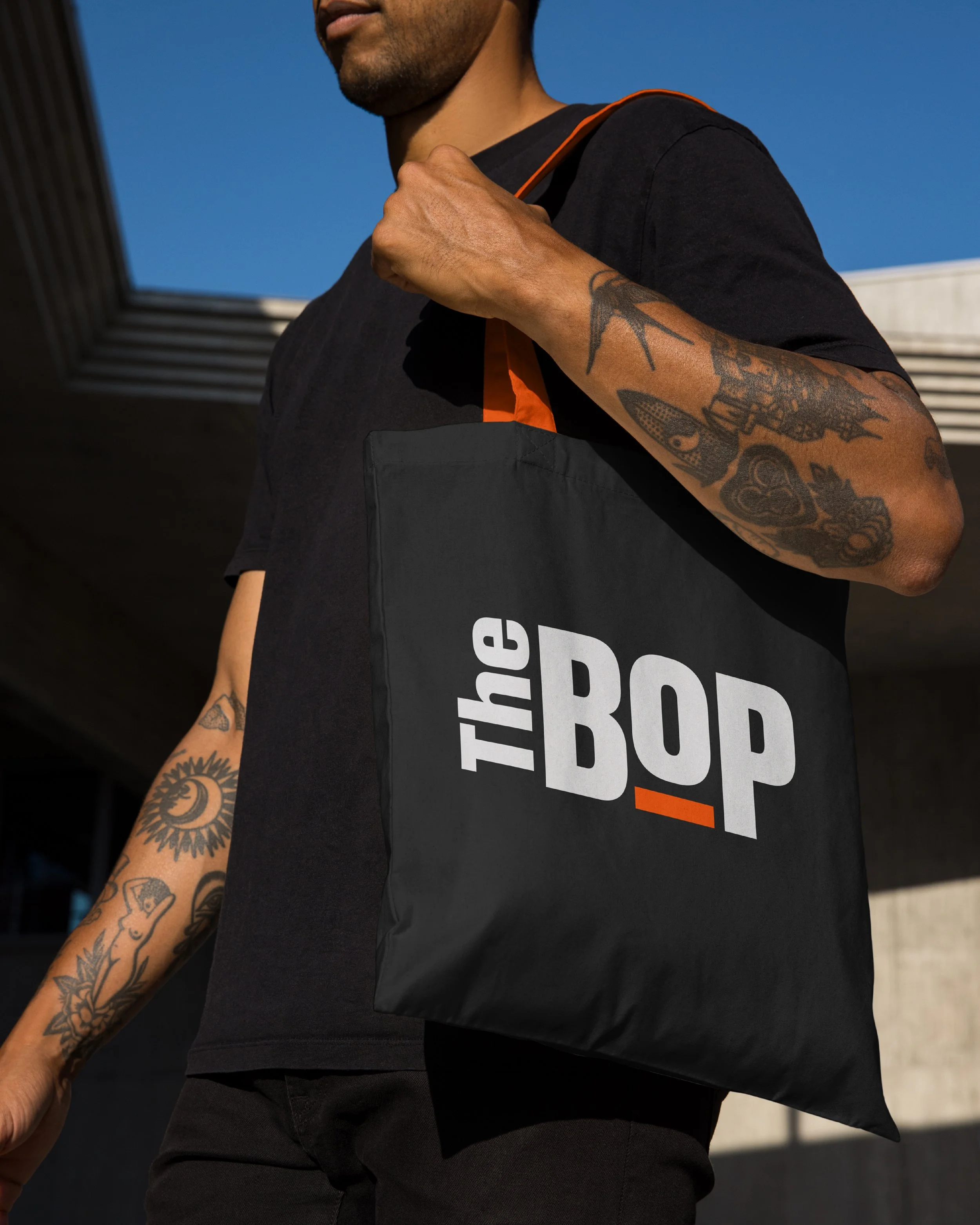
Bold typography, a warmer colour palette and a flexible graphic system helped balance that confidence with a more approachable feel. I developed brand guidelines covering everything from typography and colour to photography, layout and tone of voice.
Taking the brand into digital
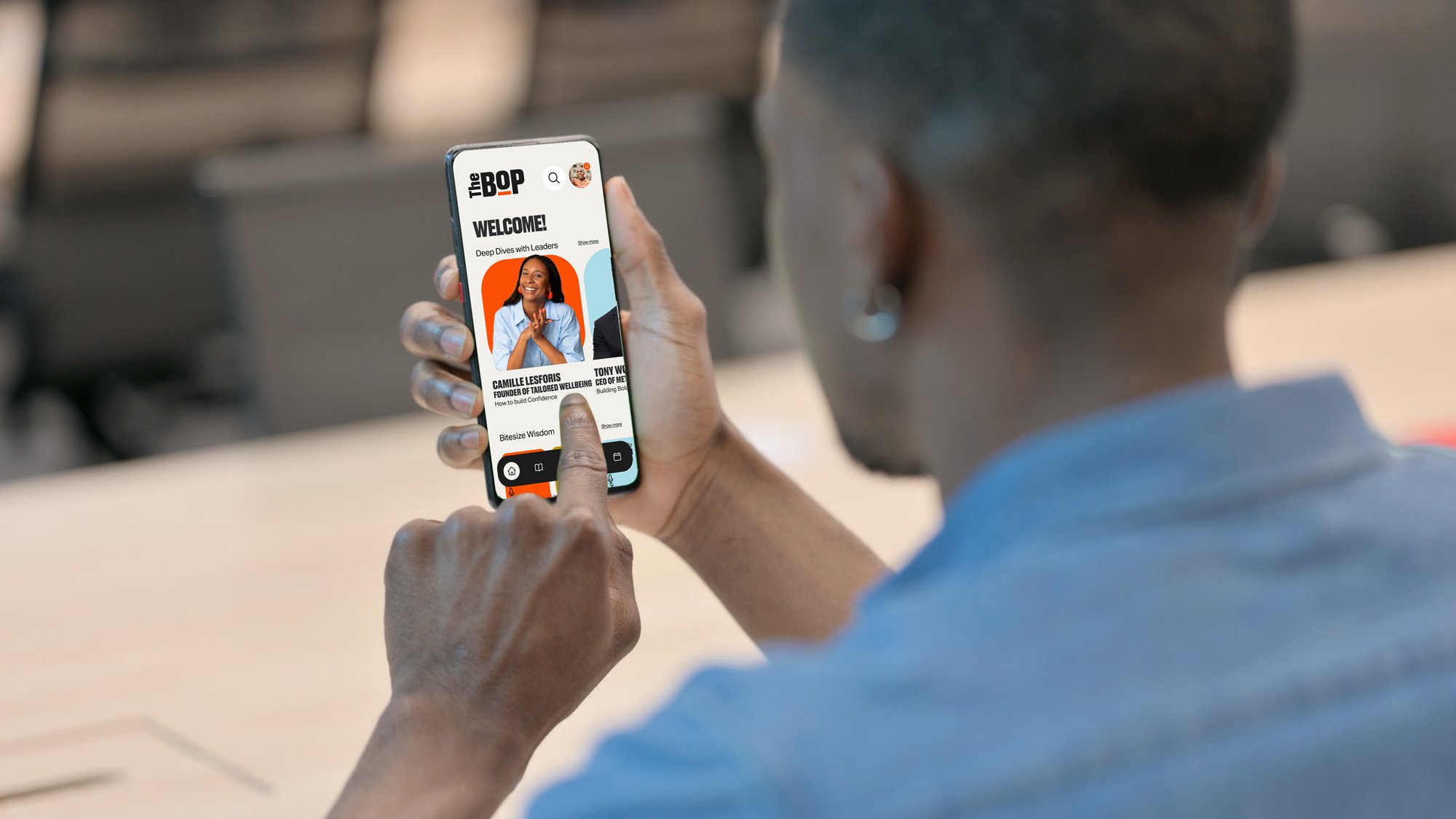
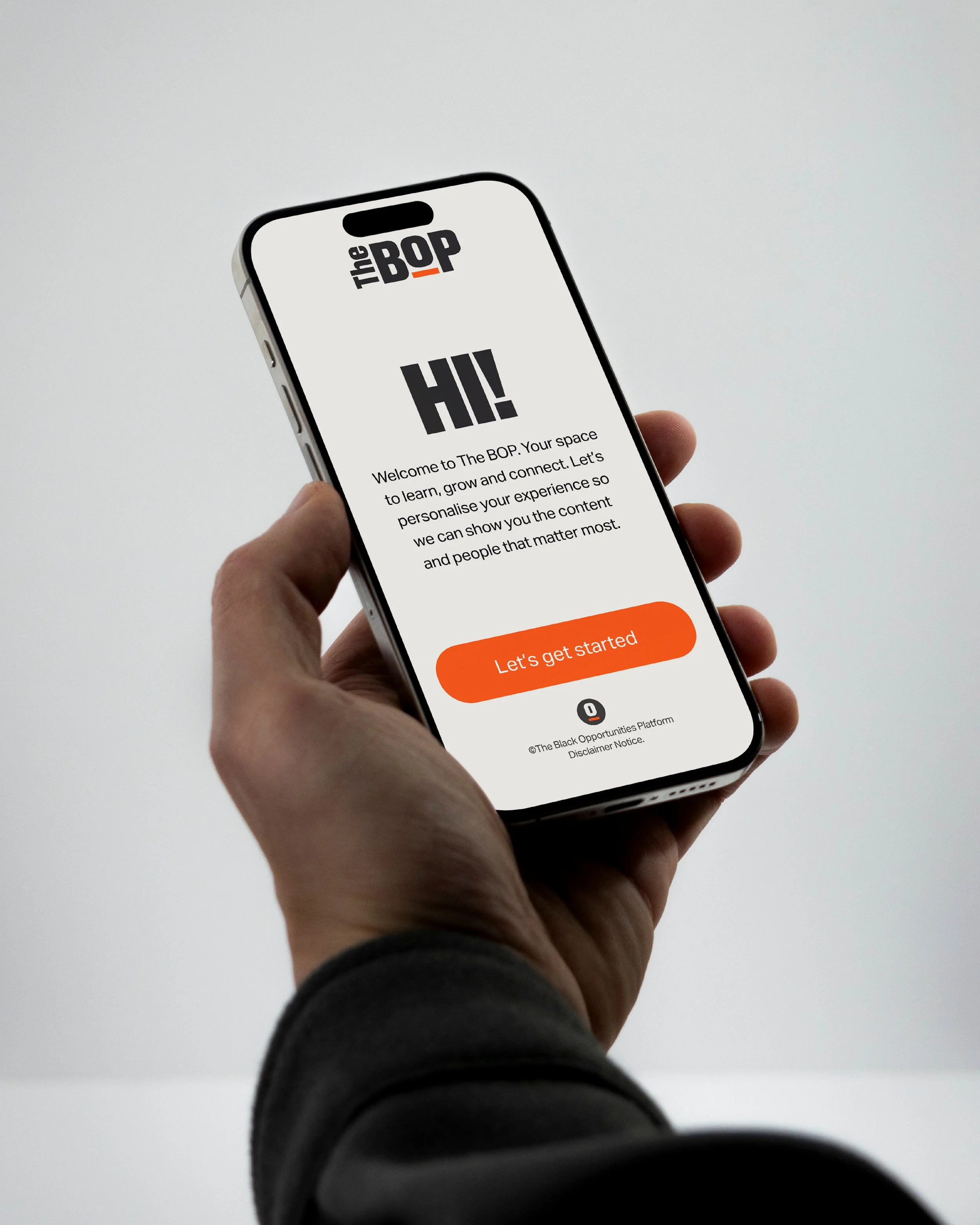
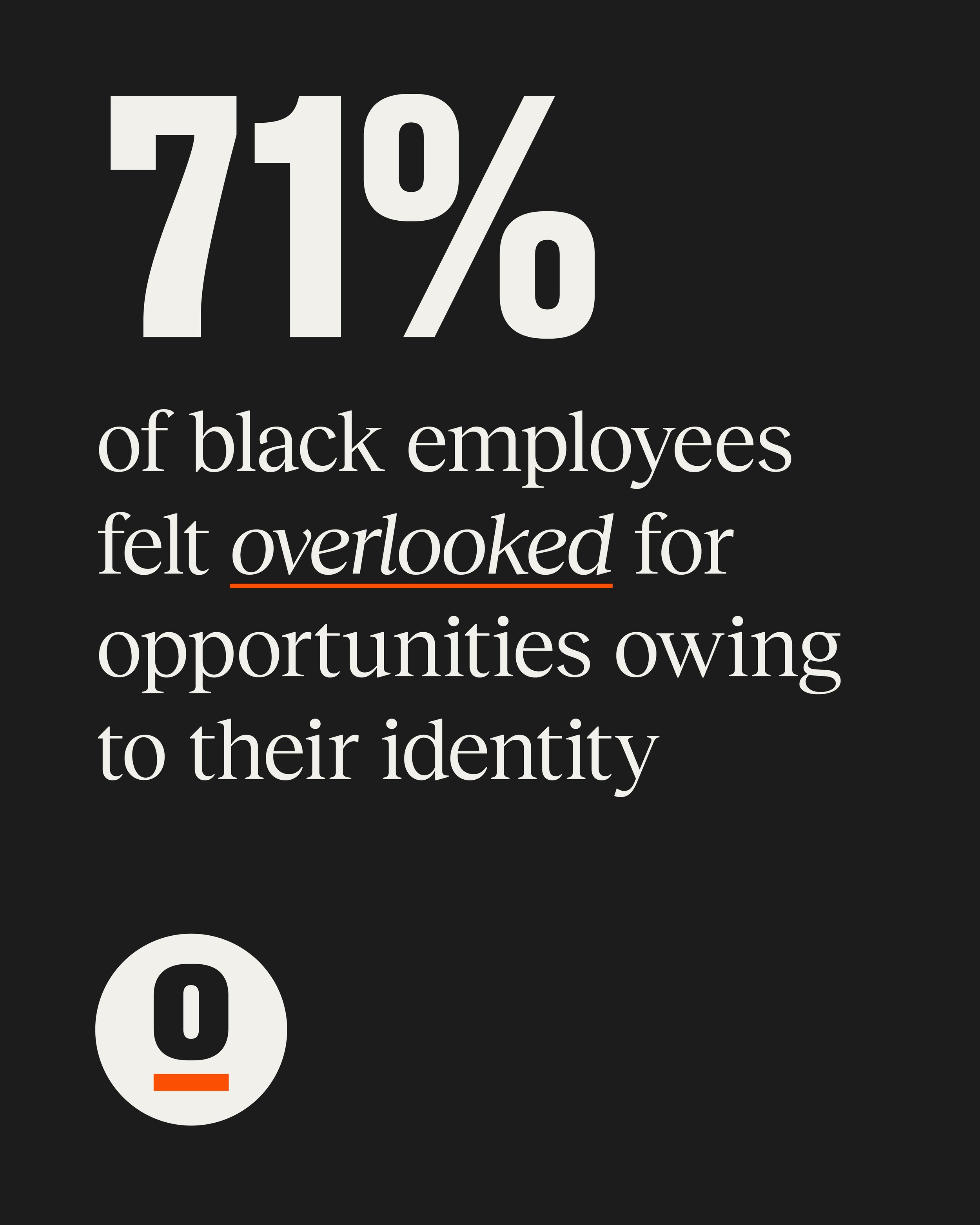
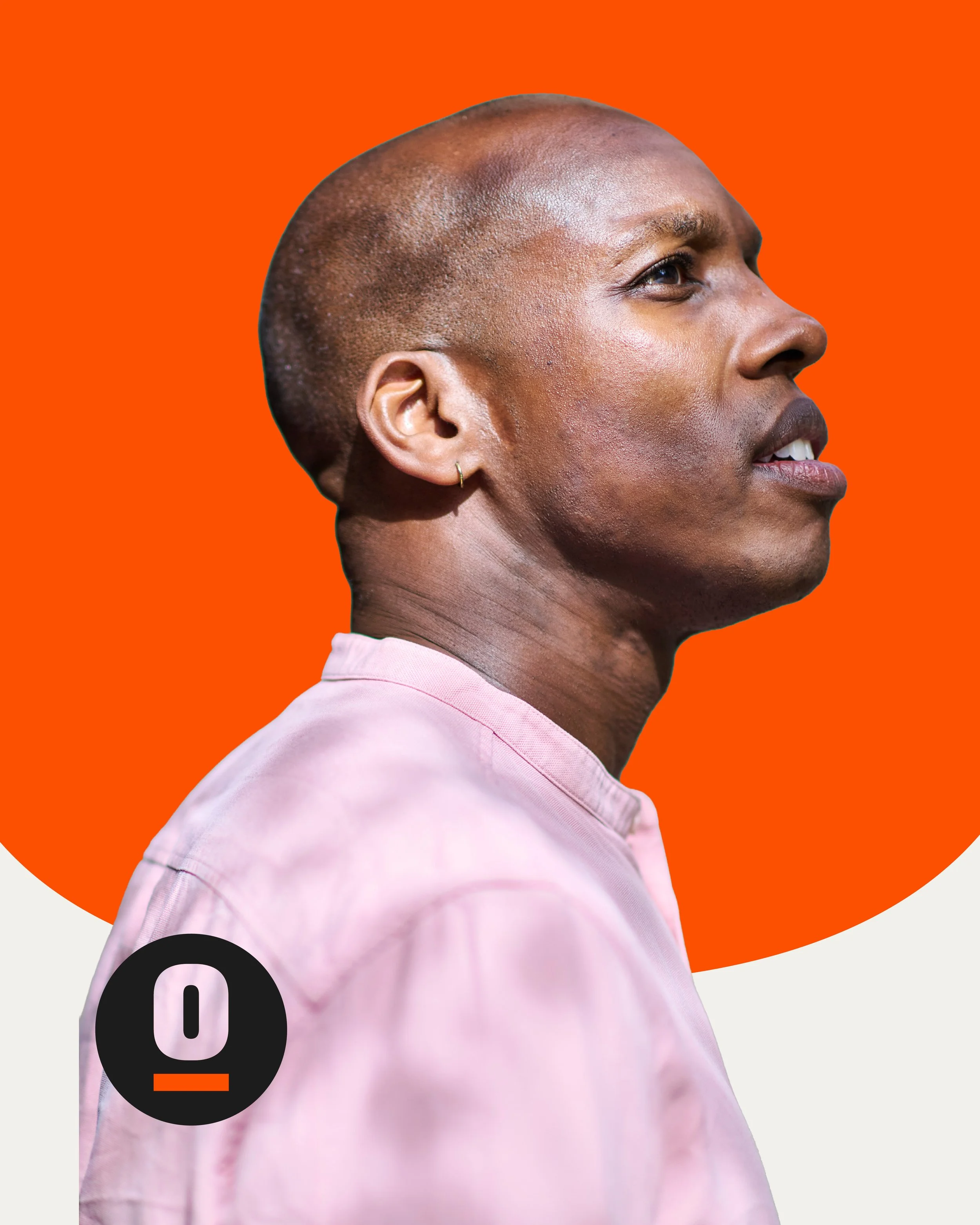
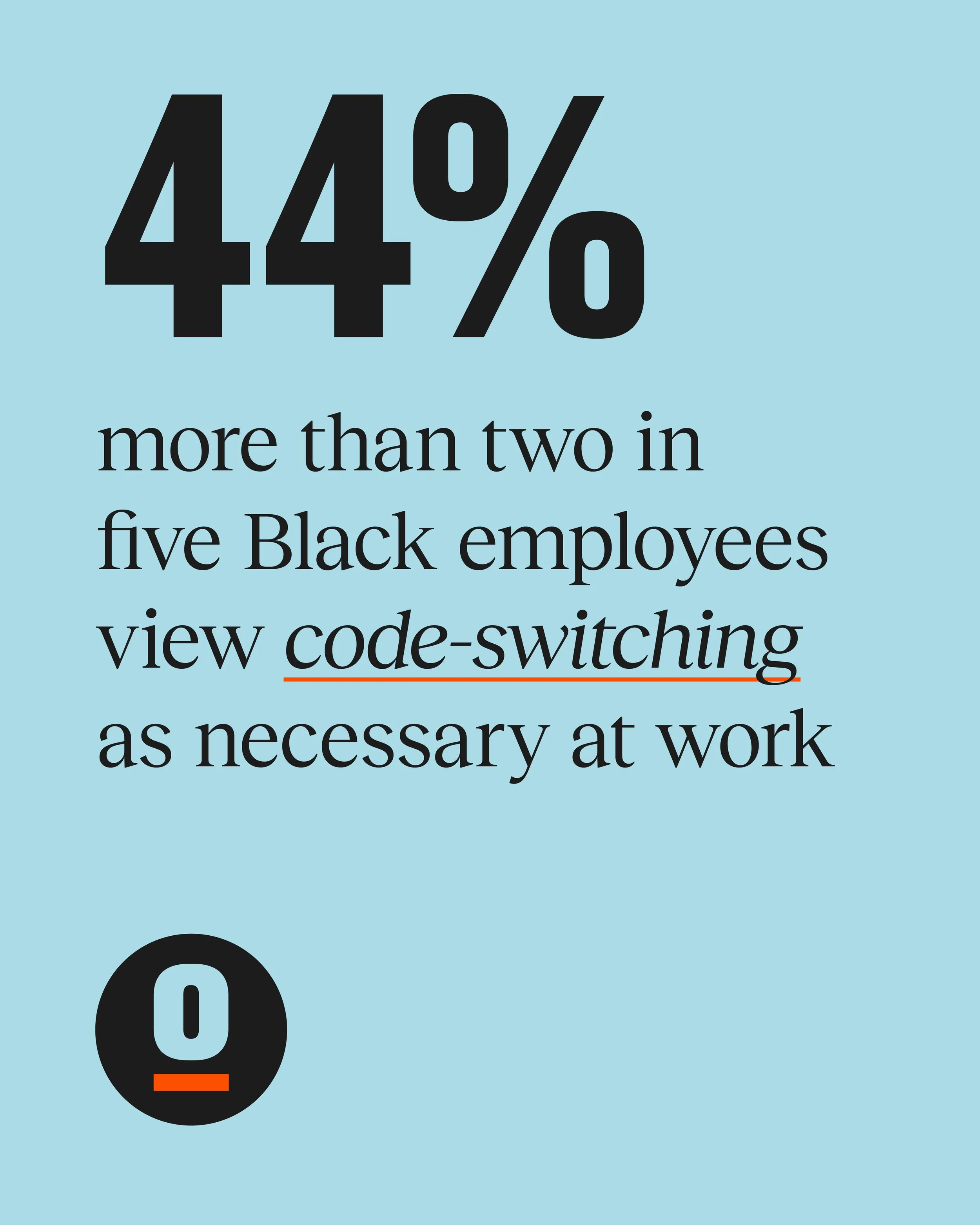
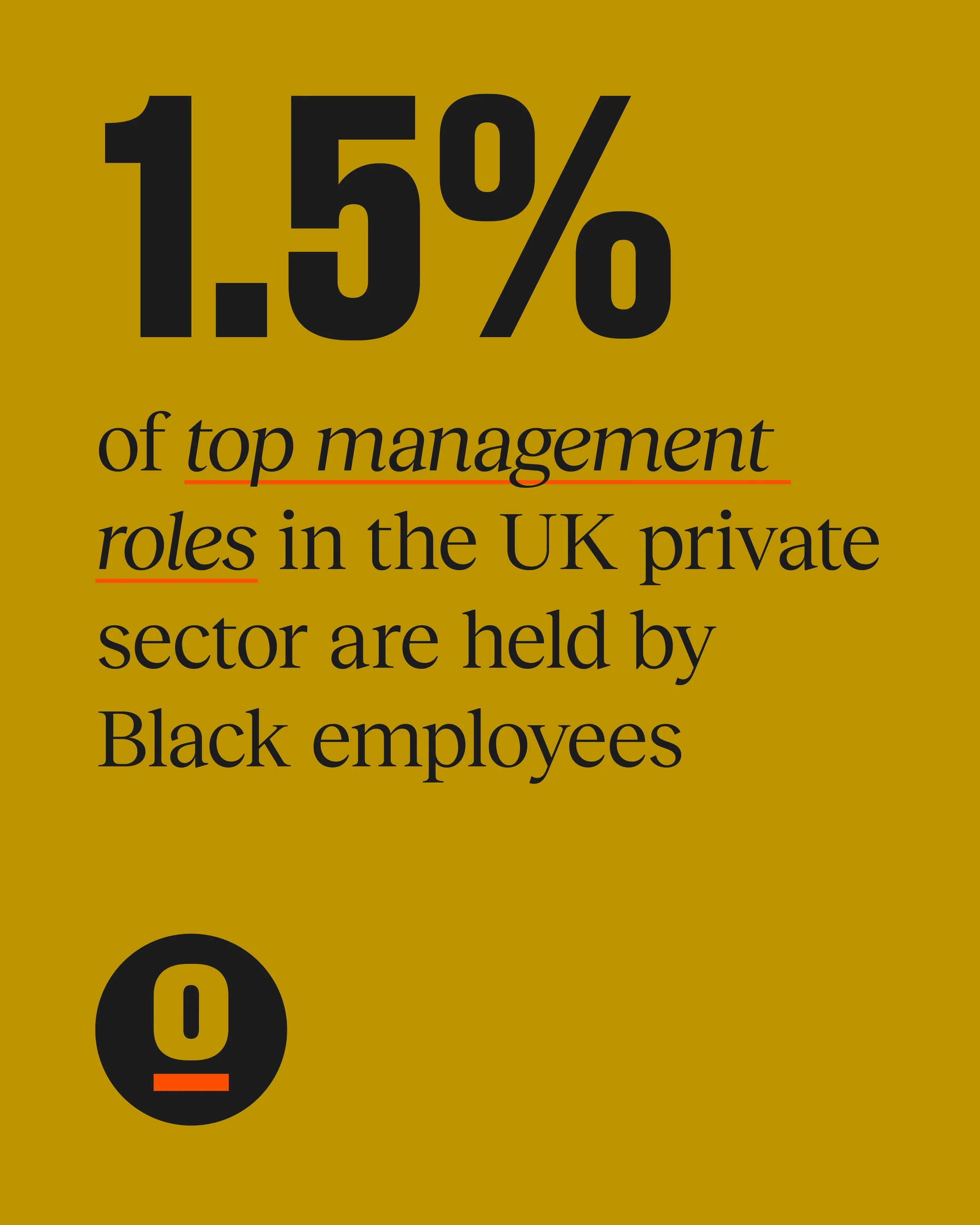
The next step was putting the new identity to work. I designed and built The BOP's original website, taking the visual language established through the branding and turning it into its first public-facing digital experience. The site needed to do a few things simply: introduce The BOP, explain why it existed, start building the community and encourage people to sign up. We deliberately kept things straightforward. Bold typography, strong statistics, candid photography and the rounded graphic language from the identity helped the site feel confident without becoming too corporate. The work included the initial launch page, website structure and content flow, responsive design and build, sign-up and survey journeys, and the wider launch site.
As The BOP developed, my involvement moved beyond the original website into the early thinking and UX/UI design for a much broader digital platform. I worked through information architecture, user journeys, wireframes and interface design, exploring how members could discover content, make connections and get more from the community. That work has since developed into a larger platform, where I've continued to provide design and UX input as it moves towards launch.
Beyond the website
As The BOP developed, I continued to apply the brand across different communications.
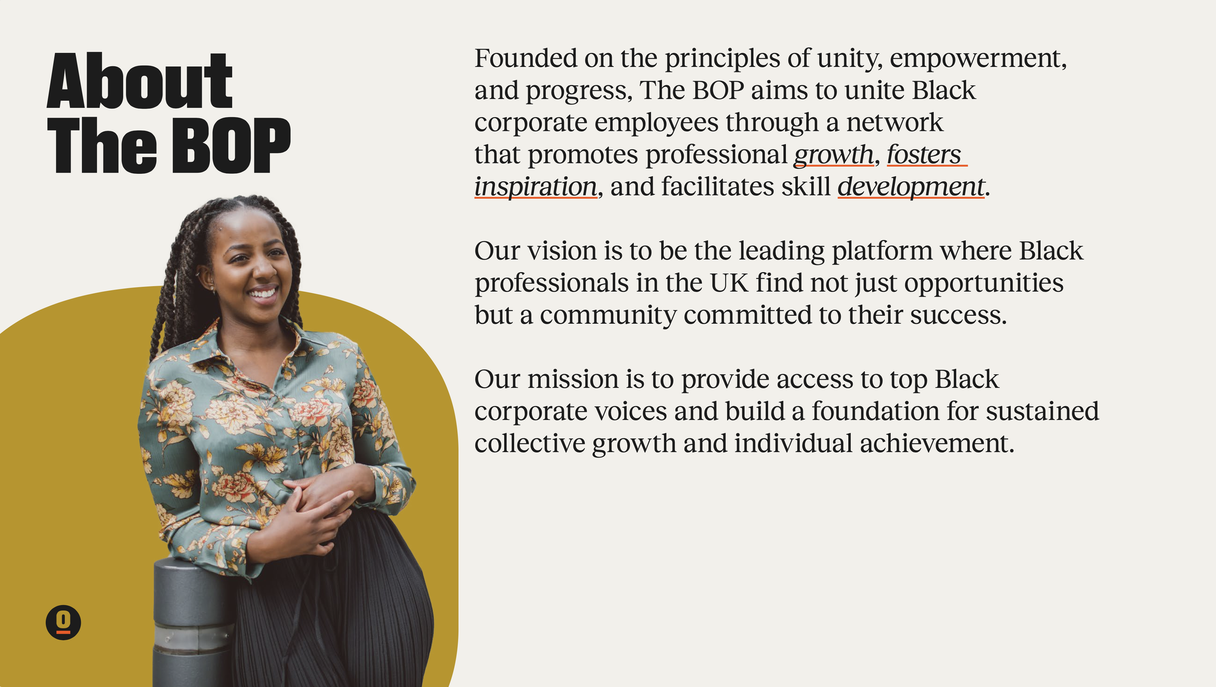
This included a branded PowerPoint template, giving presentations a consistent look without having to start from scratch each time.
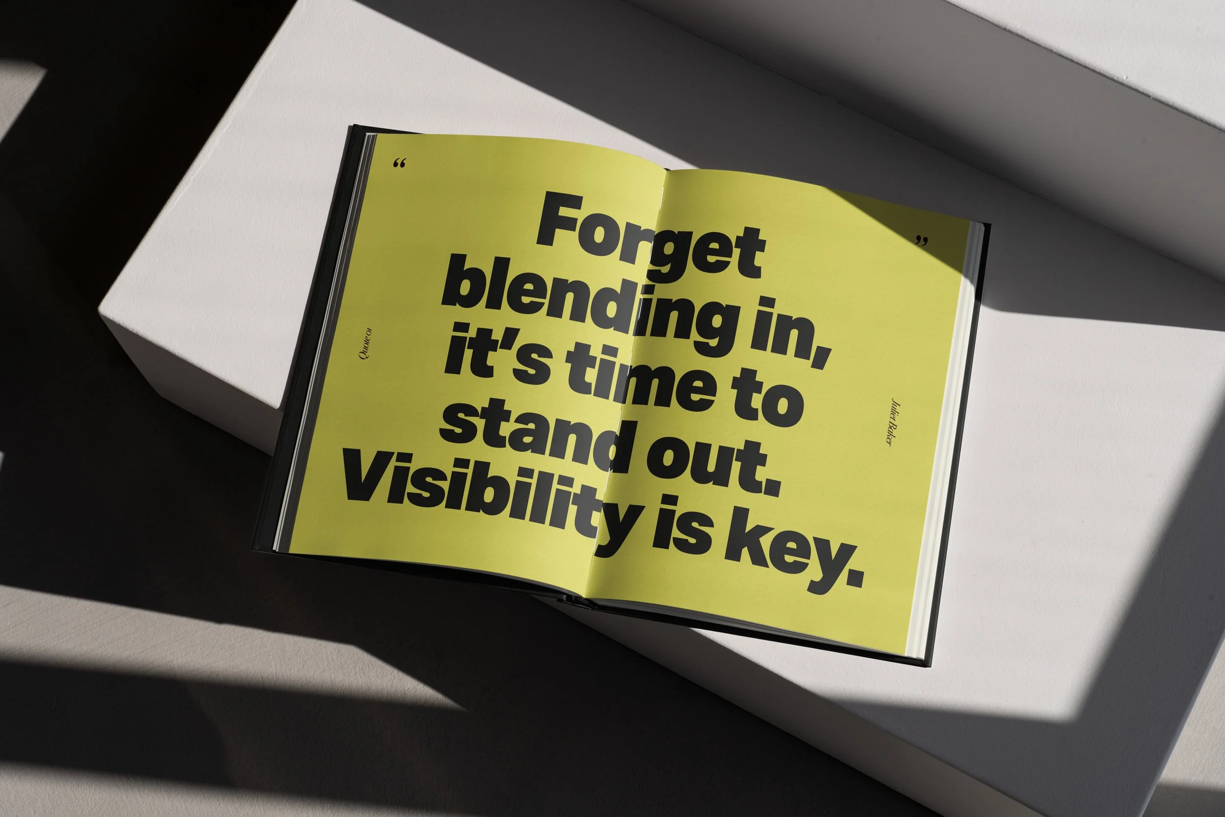
I also created a series of investor-facing visuals for a proposed book bringing together insights and experiences from Black leaders in the workplace.
Both were about making sure the brand worked beyond its original applications, whether communicating an idea, sharing information or presenting an opportunity.
One idea, carried through
What began as a visual identity has developed into a much broader design project, spanning branding, digital product concepts, user experience and ongoing art direction.
The common thread has been making The BOP feel clear, credible and approachable, whether someone encounters it through a social media post or uses the platform itself.